An operating system's visual language transcends mere aesthetics; it serves as a foundational pillar for navigation and accessibility. In recent years, Apple has pushed toward a total unification of its interface, flattening once-distinct application identities into standardized, uniform tiles. This trajectory has sparked a latent tension between a corporate drive toward minimalism and the practical, functional requirements of the end-user. Striking a balance between aesthetic purity and functional identity has emerged as one of the defining challenges facing the modern macOS ecosystem.
The evolution of Apple's graphical user interface in recent macOS iterations reveals a rigid shift toward a "unified template" philosophy. With the release of the Tahoe update, the company effectively ended the era of arbitrary shapes, imposing a strict standard of rounded corners upon developers. The technical implementation of this transition has been uncompromising: any icons failing to meet the new regulations undergo an automated transformation. The system forcibly scales down the image and places it against a neutral gray backdrop, essentially locking unique visual assets into the confines of a rigid square.

Such homogenization leads to the erosion of software identity. When every tool appears as a variation of the same square, the user's cognitive load increases. The visual cues that once allowed for the instantaneous identification of an application by its silhouette are disappearing, transforming the desktop into a monotonous grid of tiles.
This issue becomes particularly acute within the context of inclusivity and interface accessibility. For users with color vision deficiencies, the shape of an object serves as the primary identifier. In environments where the color palettes of adjacent applications may overlap, a unique icon contour acted as a reliable anchor. Stripping elements of their distinct forms effectively deprives a specific category of users of an efficient means of system navigation.
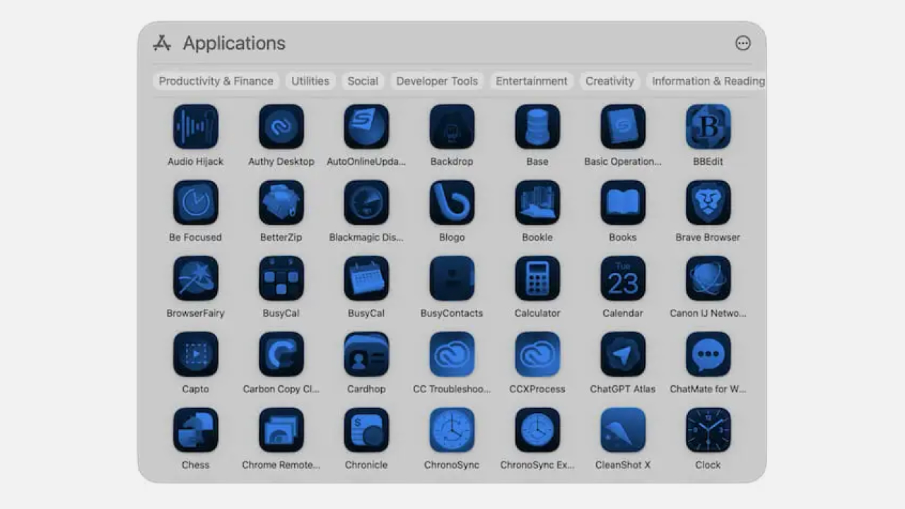
Nevertheless, the current version, macOS Golden Gate, shows signs of a corrective shift in visual direction. Apple's engineers have refined the "Liquid Glass" effect—a signature style blending depth, transparency, and soft highlights. In the new system icons, accents have become sharper, and excessive glass gloss has been scaled back in favor of greater detail. For instance, the updated Automator demonstrates higher line clarity, restoring a sense of density and professional-grade tooling to the interface.
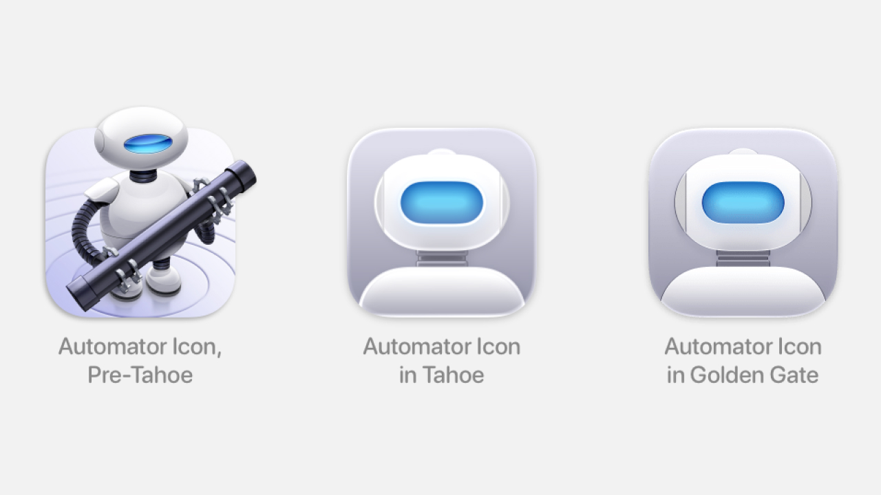
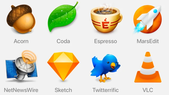
However, cosmetic refinements in glass rendering do not solve the fundamental problem of lacking shape variability. The true visual culture of the platform was always built on a balance between systemic order and the creative freedom of the developer. A return to expressive, diverse iconography could restore that quintessential macOS recognizability and ergonomics, where form conveys meaning rather than serving as a mere container for an image. Ultimately, high-quality design should enable the user to find a tool intuitively, without forcing them to squint at identical templates.
 The Price of Acceleration: CXMT’s Rapid Push into Memory